Thursday, 21 December 2017
Wednesday, 20 December 2017
Film magazine flat plans
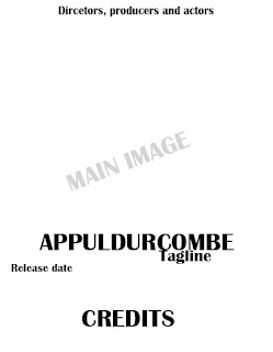
This is the first flat plan. I feel this is good because it is very simple, something which I aim to do with this magazine and go against the usual forms and conventions as they usually include a lot of information but a few go against this which I aim to do with mine. It could be too simplistic though which I will have to consider.
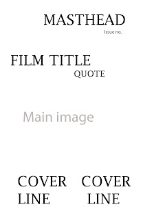
This is the second flat plan. This is more of a typical magazine layout with the cover lines located at the bottom which is common in film magazines especially. Although I do not like the fact that the masthead and the film title would be very close together which I feel would not look right considering I am planning to use the same text for the both of them.
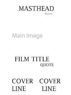
This is the third flat plan. This is also a more typical magazine layout and is very similar to the second one, but it does also keep the film title and masthead away from each other which I want to do.
In conclusion to this, I have decided to go with the first flat plan, this is because I feel that it is both unique and simplistic, which is something I aim to do with my magazine front cover so I feel the first one best fits this.
Tuesday, 19 December 2017
Forms and conventions of film magazine front covers
I have previously learned the forms and conventions of front covers of film magazines. I will now do this again in relation to film magazines instead of music magazines, although they are very similar in their structure.
Masthead
Basically the title of the magazine. It is usually located at the to of the page to stand out and is in big, bold text, this is one of the first thing the audience are attracted to so this needs to short and snappy and clearly visible.

Main image
The main image should clearly reflect the genre of the film. It is usually in mid shot and is of the main character(s) of the featured film.
Buzz words
These are words like 'free' and 'win' that grab the audiences attention and force them to buy the magazine.
Barcode, date and issue number
These are things that every magazine has, these things make it a realistic and professional feel.
Banner
Gives overall information about the magazine and the information that will be included within the magazine
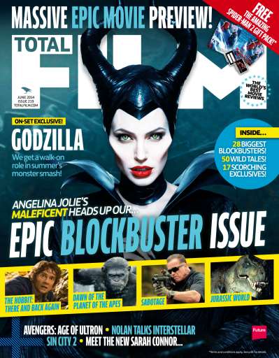
Secondary image
These will give information about another films that will be included within the film.
Cover lines
These show articles that will be included within the magazine.
After this I know the things that I need to do in my magazine, the forms and conventions that are a necessity that I follow and others that are not so important and that I could challenge.
Masthead
Basically the title of the magazine. It is usually located at the to of the page to stand out and is in big, bold text, this is one of the first thing the audience are attracted to so this needs to short and snappy and clearly visible.
Main image
The main image should clearly reflect the genre of the film. It is usually in mid shot and is of the main character(s) of the featured film.
Buzz words
These are words like 'free' and 'win' that grab the audiences attention and force them to buy the magazine.
Barcode, date and issue number
These are things that every magazine has, these things make it a realistic and professional feel.
Banner
Gives overall information about the magazine and the information that will be included within the magazine

Secondary image
These will give information about another films that will be included within the film.
Cover lines
These show articles that will be included within the magazine.
After this I know the things that I need to do in my magazine, the forms and conventions that are a necessity that I follow and others that are not so important and that I could challenge.
Monday, 18 December 2017
Wednesday, 13 December 2017
Poster Title
I will be using the same font as the one for the credits used in the trailer. I feel this makes it more familiar between the different products, from my research I learnt that this is a common convention for companies to do when producing a film, an example of this is for the film Insidious 4. I have got this title of a website called www.dafont.com.
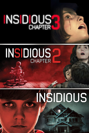
I am using this font as it creates a house style between the different types of production and can make the audience become familiar with it, this is very common in other productions for example Insidious. The font is bold and clearly visible but also has the horror look to it, I feel that it is more important for the audience to clearly see it then for the title to portray horror if it ruins the look. Despite this I still feel that the font does portray elements of horror through its simplicity and the effects added to it gives it more of a horror feel.
Now I have decided this I can start the production of the film poster as I have now decided the photo, they layout and the title.
Sunday, 10 December 2017
Poster photos
All of the photos that I will choose from are mid shot, I chose this because I feel it best suits the poster layout and clearly shows the emotion of Jack but also can see the building in which the main chunk of the story is based on. I took a large number of photos but I feel these are the best four options. I will look at the best bits of each photo in order to make a decision for my poster.
This photo is good because his eye contact with the audience clearly shows his emotion to be at
this location, enticing them to see the film. Also, the building is a bit brighter than the other photos so it is clearer to see.
This photo is very similar but without the eye-contact. I feel this is effective because the way he is looking away portrays he could be distracted by the paranormal, which relates well to the narrative.

The third photo I feel is mainly good because it much more natural than the others as this is how it actually is in the trailer. Despite this I feel his emotion needs to shown in order to portray the horror genre.

This photo is very similar to the second one and has the same positives about it, I just felt it was necessary to cover both angles in order to see which one looked better, but changed the angle of his head slightly.
In conclusion to all this, I have decided to go with the first option. This is mainly because I feel the eye contact with the audience is fundamental in creating that relationship and his emotion is clearly scared and distressed which portrays the horror genre. Also the building is slightly lighter in this image, this will mean I will not have to adjust the brightness so it will look more natural.
This photo is good because his eye contact with the audience clearly shows his emotion to be at
this location, enticing them to see the film. Also, the building is a bit brighter than the other photos so it is clearer to see.
This photo is very similar but without the eye-contact. I feel this is effective because the way he is looking away portrays he could be distracted by the paranormal, which relates well to the narrative.
The third photo I feel is mainly good because it much more natural than the others as this is how it actually is in the trailer. Despite this I feel his emotion needs to shown in order to portray the horror genre.
This photo is very similar to the second one and has the same positives about it, I just felt it was necessary to cover both angles in order to see which one looked better, but changed the angle of his head slightly.
In conclusion to all this, I have decided to go with the first option. This is mainly because I feel the eye contact with the audience is fundamental in creating that relationship and his emotion is clearly scared and distressed which portrays the horror genre. Also the building is slightly lighter in this image, this will mean I will not have to adjust the brightness so it will look more natural.
Saturday, 9 December 2017
Poster flat plans
This is the first choice of the structure of the poster. I feel that this is a good structure as the main image and the title are located in the centre of the page. Although I feel this way is a bit basic as this is the usual way to structure a film poster and I feel that it will not be unique if I follow all the forms and conventions and I need to go against some.
This second choice is quite different to the usual structure, although it isn't too different that it ruins the overall layout. The reasons why I would choose it is that it is unique and this can be interesting
for the audience to see. Despite this I do think that the release date needs to be in a much better position to be clearly seen.
The third choice is also very unique because it isn't the usual layout, despite this I feel that it is is very effective because everything is located in the centre of the page and I feel this is clear for the audience to see everything. I also might not include the director's, producer's and actor's names because I feel it takes away the scariness of the poster.
After analysing the positives and negatives of each one and I feel that the third option is the best because it is follows the general forms and conventions but also is also very unique. I feel the fact that everything is central to the page it is easier for the audience to see.
Wednesday, 6 December 2017
Commone themes of horror film posters
From looking at and deconstructing other horror film posters. I am now going to establish the forms and conventions based on these deconstructions and also other posters.

The title of horror film posters are usually located in the centre of the page, but just below from the main image or just a bit lower at the bottom of the page. This is so that it is clear to see and large in the centre of the page. The main colour for the titles is usually red and white, this is to stand out to the audience and also the colours both clearly represent the genre of horror. The title is also in bold capital letters to also stand out to the audience and can clearly be read and understood.
 The main images of horror film posters vary quite a lot as this is an area which is specific to the film. Although I have picked out a few similarties that I need to consider. One of these being that the main image is usually of one person, either the antagonist or the protagonist, also the shots of them also vary, from mid shot to long shot and even to extreme close up. Another convention I have seen is that the main image is usually shot in dark lighting to follow the forms and conventions of horror.
The rest of the conventions are as discussed before but all have their own thing to make it suit the horror genre, an example of this is the text of the extra information is quite jagged to make it look scary to the audience. Everything in the poster needs to clearly represent horror so that it is clear to the audience.
Title
The title of horror film posters are usually located in the centre of the page, but just below from the main image or just a bit lower at the bottom of the page. This is so that it is clear to see and large in the centre of the page. The main colour for the titles is usually red and white, this is to stand out to the audience and also the colours both clearly represent the genre of horror. The title is also in bold capital letters to also stand out to the audience and can clearly be read and understood.
Main image
Tagline
As you can see from these three examples that the taglines for horror posters are usually located at the top of the page and are in white writing, this is to contrast the dark lighting.
The rest of the conventions are as discussed before but all have their own thing to make it suit the horror genre, an example of this is the text of the extra information is quite jagged to make it look scary to the audience. Everything in the poster needs to clearly represent horror so that it is clear to the audience.
Tuesday, 5 December 2017
Audience within poster
Although the audience is exactly the same as that for my trailer. There are things I need to do to ensure that my target audience is attracted to it. I will list the main things that are essential in making a successful horror poster. These main points are from my analysis and deconstructions of other horror posters.
- Bold capital letters either in white/grey or red
- 1 main image of either the protagonist or antagonist
- Keep it simple
- Make it look scary to clearly show the genre
I feel these are the main conventions that I need to follow, although I can still go against the forms and conventions too to make it unique and interesting.
Saturday, 2 December 2017
Deconstruction of film poster 2
Saw 2 Poster
The main thing that stands out to me is the rough almost 'cut up' look to the masthead mainly and other parts of the poster hugely corresponds to the message of blood and gore in the film, and this links to the two fingers as part of the masthead which also signifies the gore, the genre of the film and could even be a sneak preview into what is to come in the film. It is located just below the centre of the poster and this is so it stands out clearly to the audience and the audience can clearly recognise the title of the film as it is the most important thing in making a clear brand image. The title is also in a silvery colour which could possibly relate to an actual saw, this could also be related to the two fingers and be included in the film so I think this is very clever if this is what they were trying to portray within this, this links to Barthes' symbolic code in which they showed a deeper meaning.
All the colours used in this poster are very symbolic into the meaning that the poster is supposed to put across and all suit the genre of the film very well. First of, the pitch black background is used to signify death, evil and horror, it also works well as it makes everything around it stand out clearly as most colours contrast with black and it further adds to the tension and bad atmosphere which is trying to be put across for the film. The red also symbolises death and horror but also signifies blood, which is a very strong part of the saw franchise and the way it is edited in way it looks smeared and rough looking which makes it look more realistic and mysterious. Also the red is in the eye of Jig Saw the antagonist which signifies his evilness and clearly shows little previews to the film what will attract the target audience. The other colour is white/silver which I have previously spoke about but it is used to stand out well for the text and also signifies mystery but can be to signify innocence which could be used to show the battle of good vs evil which links to Strauss' binary oppositions.
The antagonist in this is located in the top left hand side and is covers roughly a quarter of the page, this highlights his importance in the film. There is a low angle used for the photo of him and he is at the top of the page to show his dominance over the protagonists in the film, and is also looking down which further relates to this. He is half covered by the darkness which shows his mysterious actions he posses like why he has chosen to do what he does to people and nobody knows why. Even though the protagonists are more included in the film the antagonist is usually put on the front cover as it clearly shows the genre.
In summary, this poster has hugely helped me for when I do my ancillary task for a poster of our film trailer. It has taught me how fundamental colour and the positioning of things is in order to attract the target audience.
Thursday, 30 November 2017
Deconstruction of film poster 1
Insidious film poster
I chose this film poster as I feel that it is quite unusual to others and goes against a few of the codes and conventions of horror and in general film posters. One of the ways in which it does this is the title, although it is located in the middle, it is quite small and vertical, whereas usually they are much larger and horizontal to the page so that they are easily recognisable. This could be to make theirs unique and that the 'insidious' could be represented to be inside the boy who is the main image to show that he has been possessed, also following the forms and conventions of giving hints into what happens in the actual film. The main image also goes against the forms and conventions of horror film posters as it has one of the protagonists as the main image, whereas usually it is the antagonist which is the main image, although they have given theirs a unique touch by altering it in a way that is still effective as the evil is within the boy. Also, a little boy is usually used to signify innocence but this connotes that the evil forces have ruined this normal stereotype.
The use of colours are very effective also, the dark gloomy look clearly highlights the evil within the film and the young boy, almost like a pathetic fallacy. There is also a use of red in the title and on the boys pyjamas which signifies blood and anger, although this could be seen to be different as this is a paranormal film and not a gory film, but the use of red usually signifies danger, especially in the horror genre. The use of white also goes against the forms and conventions as it signifies innocence and heaven, but this is used to contrast good and evil (Staruss' theory) and show that the evilness has transformed the boy from innocence to evil. The main image is very effective because although it is quite different, the little boy is directly looking into the camera, the possessed look and dark lighting work well into almost making him look like the antagonist. The eye contact between the audience and the boy is done to make it more scary as his eyes look very evil, this is done to scare the audience but also feel sympathy for the boy and entice them into watching the film.
In conclusion, I feel this is a very good and effective film poster as it goes against a few forms and conventions but does it in a way that isn't bad but in a way that gives their poster a unique and exciting twist to give a unique selling point to other horror film posters. This is definitely something I will use in my film poster to make it stand out and give the audience something new and different.
Sunday, 26 November 2017
Forms and conventions of film posters
Image
There is usually a large main image which covers up the majority of the page, this is so that the audience/people walking past will get their attention caught by the large image. They can either be a shot taken directly from the film or from a shoot before but it usually shows what genre the film is.
Title
Nearly all film posters have a title, unless the film is so popular that it is not needed. If there is a title it is usually in the middle and just below the main image.
Directors, producers and actors
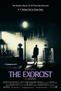 These people are most of the time included and are near the title, especially if it is a well-known name as it will stand out more near the title. If it is a small budget film then normally only the main characters are named, but if it is big budgeted film it usually will have more well known names so will include all of these in order to attract a wider audience.
Quotes, recommendations and ratings
When critics have seen the film, they redo their posters and add the positive things said about them, especially if it by someone who is well known giving it a high rating as people will want to see the film because of this, an example of a well known company is UK Film Magazine.
Awards
If the poster is put out near awards season then these will be put near the names of the directors, producers and actors who have won an award which will make their name more widely known and will force the audience into thinking this is a good film to see because of this, as it gives them a unique selling point above competitors
Taglines
These are used to give a hint about the film and add a tiny bit of context. They can also be a common line from the film, for example in Forrest Gump "life is like a box of chocolates" is used.
Date and extra information
This shows the date of the release so that the audience doesn't miss it. The extra information shows things like the age restriction of the film and if there is things like swearing included. This is usually located at the bottom of the poster as it isn't as important as the rest of the poster.
I feel that Barthes' codes relate to this very well. The enigma code is when the audience is left asking questions, and this is the main aim of film posters to entice them into watching the film. Also the semantic code relates to this as it is common in posters for them to be symbolic for something which is included in the film.
There is usually a large main image which covers up the majority of the page, this is so that the audience/people walking past will get their attention caught by the large image. They can either be a shot taken directly from the film or from a shoot before but it usually shows what genre the film is.
Title
Nearly all film posters have a title, unless the film is so popular that it is not needed. If there is a title it is usually in the middle and just below the main image.
Directors, producers and actors
 These people are most of the time included and are near the title, especially if it is a well-known name as it will stand out more near the title. If it is a small budget film then normally only the main characters are named, but if it is big budgeted film it usually will have more well known names so will include all of these in order to attract a wider audience.
Quotes, recommendations and ratings
When critics have seen the film, they redo their posters and add the positive things said about them, especially if it by someone who is well known giving it a high rating as people will want to see the film because of this, an example of a well known company is UK Film Magazine.
Awards
If the poster is put out near awards season then these will be put near the names of the directors, producers and actors who have won an award which will make their name more widely known and will force the audience into thinking this is a good film to see because of this, as it gives them a unique selling point above competitors
Taglines
These are used to give a hint about the film and add a tiny bit of context. They can also be a common line from the film, for example in Forrest Gump "life is like a box of chocolates" is used.
Date and extra information
This shows the date of the release so that the audience doesn't miss it. The extra information shows things like the age restriction of the film and if there is things like swearing included. This is usually located at the bottom of the poster as it isn't as important as the rest of the poster.
I feel that Barthes' codes relate to this very well. The enigma code is when the audience is left asking questions, and this is the main aim of film posters to entice them into watching the film. Also the semantic code relates to this as it is common in posters for them to be symbolic for something which is included in the film.
Saturday, 25 November 2017
Final trailer
I feel that overall the filming and editing process has gone very well and that it is the best that it could have gone due to the successful research and planning stage. Me and my partner worked very well together to achieve this considering there were some difficulties to begin with.
Editing process
We started off with a blank document to start this off, we uploaded all the clips from the camera by connecting it to the computer.
First of all we selected all the right clips and good shots that were to be included and layered them into the right order. This step was quite easy due to the storyboard we created beforehand which includes the order of the shots and the timing of each shot.
I then added in the credits, for this we added in a black background that had an opposite fade from the middle so the writing would look better and stand out. The fade also makes it look more professional than just a standard black background. We also added an effect to the text in order to make it flash in a way that makes it look like it had been overcome by paranormal activity.
On this glitch effect which was added throughout the editing on a number of different things, I made it transparent by using the displacement map video effect which meant gave the video a horror look to it and clearly portrayed the genre.
This is how the final interface looked. This production really helped me understand how to layer clips and the importance of sounds in production as before the sound was added it seemed completely different.
Thursday, 23 November 2017
Learning Sony Vegas Pro
https://www.youtube.com/watch?v=A6l8kk9qW-4
https://www.youtube.com/watch?v=eLSHYe1-LuE
These youtube tutorials have taught us the general details of how to use Sony Vegas. When we need to learn something specific we will have to again youtube how to do that specific editing, an example of this is adding sounds to the production.
https://www.youtube.com/watch?v=Eknb_ft67XY
The editing process is so important that every specific detail needs to be considered in attracting the audience and the message that is sent out by every detail. How the audience interpret something is the most fundamental part. Learning Sony Vegas will aid me in making sure every detail is perfect as this is a very professional editing software.
Subscribe to:
Comments (Atom)


