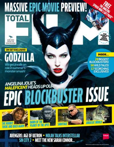
Masthead
Basically the title of the magazine. It is usually located at the to of the page to stand out and is in big, bold text, this is one of the first thing the audience are attracted to so this needs to short and snappy and clearly visible.
Main image
The main image should clearly reflect the genre of the film. It is usually in mid shot and is of the main character(s) of the featured film.
Buzz words
These are words like 'free' and 'win' that grab the audiences attention and force them to buy the magazine.
Barcode, date and issue number
These are things that every magazine has, these things make it a realistic and professional feel.
Banner
Gives overall information about the magazine and the information that will be included within the magazine

Secondary image
These will give information about another films that will be included within the film.
Cover lines
These show articles that will be included within the magazine.
After this I know the things that I need to do in my magazine, the forms and conventions that are a necessity that I follow and others that are not so important and that I could challenge.
No comments:
Post a Comment