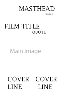
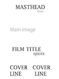
This is the first flat plan. I feel this is good because it is very simple, something which I aim to do with this magazine and go against the usual forms and conventions as they usually include a lot of information but a few go against this which I aim to do with mine. It could be too simplistic though which I will have to consider.

This is the second flat plan. This is more of a typical magazine layout with the cover lines located at the bottom which is common in film magazines especially. Although I do not like the fact that the masthead and the film title would be very close together which I feel would not look right considering I am planning to use the same text for the both of them.

This is the third flat plan. This is also a more typical magazine layout and is very similar to the second one, but it does also keep the film title and masthead away from each other which I want to do.
In conclusion to this, I have decided to go with the first flat plan, this is because I feel that it is both unique and simplistic, which is something I aim to do with my magazine front cover so I feel the first one best fits this.

No comments:
Post a Comment