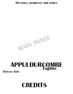
This is the first choice of the structure of the poster. I feel that this is a good structure as the main image and the title are located in the centre of the page. Although I feel this way is a bit basic as this is the usual way to structure a film poster and I feel that it will not be unique if I follow all the forms and conventions and I need to go against some.
This second choice is quite different to the usual structure, although it isn't too different that it ruins the overall layout. The reasons why I would choose it is that it is unique and this can be interesting
for the audience to see. Despite this I do think that the release date needs to be in a much better position to be clearly seen.
The third choice is also very unique because it isn't the usual layout, despite this I feel that it is is very effective because everything is located in the centre of the page and I feel this is clear for the audience to see everything. I also might not include the director's, producer's and actor's names because I feel it takes away the scariness of the poster.
After analysing the positives and negatives of each one and I feel that the third option is the best because it is follows the general forms and conventions but also is also very unique. I feel the fact that everything is central to the page it is easier for the audience to see.


No comments:
Post a Comment