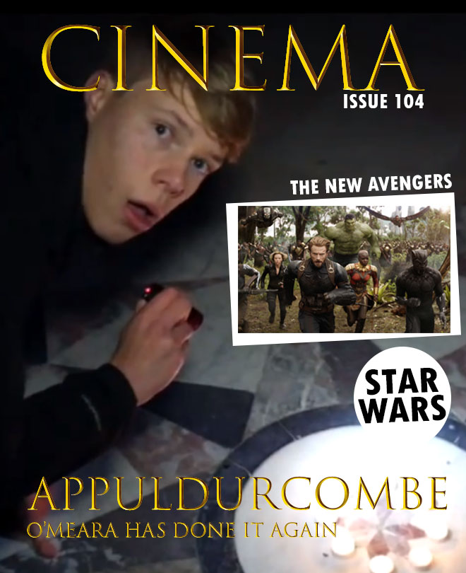
Thursday, 21 December 2017

Wednesday, 20 December 2017
Film magazine flat plans

This is the first flat plan. I feel this is good because it is very simple, something which I aim to do with this magazine and go against the usual forms and conventions as they usually include a lot of information but a few go against this which I aim to do with mine. It could be too simplistic though which I will have to consider.

This is the second flat plan. This is more of a typical magazine layout with the cover lines located at the bottom which is common in film magazines especially. Although I do not like the fact that the masthead and the film title would be very close together which I feel would not look right considering I am planning to use the same text for the both of them.

This is the third flat plan. This is also a more typical magazine layout and is very similar to the second one, but it does also keep the film title and masthead away from each other which I want to do.
In conclusion to this, I have decided to go with the first flat plan, this is because I feel that it is both unique and simplistic, which is something I aim to do with my magazine front cover so I feel the first one best fits this.
Tuesday, 19 December 2017
Forms and conventions of film magazine front covers
I have previously learned the forms and conventions of front covers of film magazines. I will now do this again in relation to film magazines instead of music magazines, although they are very similar in their structure.
Masthead
Basically the title of the magazine. It is usually located at the to of the page to stand out and is in big, bold text, this is one of the first thing the audience are attracted to so this needs to short and snappy and clearly visible.

Main image
The main image should clearly reflect the genre of the film. It is usually in mid shot and is of the main character(s) of the featured film.
Buzz words
These are words like 'free' and 'win' that grab the audiences attention and force them to buy the magazine.
Barcode, date and issue number
These are things that every magazine has, these things make it a realistic and professional feel.
Banner
Gives overall information about the magazine and the information that will be included within the magazine
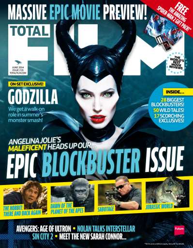
Secondary image
These will give information about another films that will be included within the film.
Cover lines
These show articles that will be included within the magazine.
After this I know the things that I need to do in my magazine, the forms and conventions that are a necessity that I follow and others that are not so important and that I could challenge.
Masthead
Basically the title of the magazine. It is usually located at the to of the page to stand out and is in big, bold text, this is one of the first thing the audience are attracted to so this needs to short and snappy and clearly visible.
Main image
The main image should clearly reflect the genre of the film. It is usually in mid shot and is of the main character(s) of the featured film.
Buzz words
These are words like 'free' and 'win' that grab the audiences attention and force them to buy the magazine.
Barcode, date and issue number
These are things that every magazine has, these things make it a realistic and professional feel.
Banner
Gives overall information about the magazine and the information that will be included within the magazine
Secondary image
These will give information about another films that will be included within the film.
Cover lines
These show articles that will be included within the magazine.
After this I know the things that I need to do in my magazine, the forms and conventions that are a necessity that I follow and others that are not so important and that I could challenge.
Monday, 18 December 2017

Wednesday, 13 December 2017
Poster Title
I will be using the same font as the one for the credits used in the trailer. I feel this makes it more familiar between the different products, from my research I learnt that this is a common convention for companies to do when producing a film, an example of this is for the film Insidious 4. I have got this title of a website called www.dafont.com.

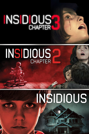
I am using this font as it creates a house style between the different types of production and can make the audience become familiar with it, this is very common in other productions for example Insidious. The font is bold and clearly visible but also has the horror look to it, I feel that it is more important for the audience to clearly see it then for the title to portray horror if it ruins the look. Despite this I still feel that the font does portray elements of horror through its simplicity and the effects added to it gives it more of a horror feel.
Now I have decided this I can start the production of the film poster as I have now decided the photo, they layout and the title.
I am using this font as it creates a house style between the different types of production and can make the audience become familiar with it, this is very common in other productions for example Insidious. The font is bold and clearly visible but also has the horror look to it, I feel that it is more important for the audience to clearly see it then for the title to portray horror if it ruins the look. Despite this I still feel that the font does portray elements of horror through its simplicity and the effects added to it gives it more of a horror feel.
Now I have decided this I can start the production of the film poster as I have now decided the photo, they layout and the title.
Sunday, 10 December 2017
Poster photos
All of the photos that I will choose from are mid shot, I chose this because I feel it best suits the poster layout and clearly shows the emotion of Jack but also can see the building in which the main chunk of the story is based on. I took a large number of photos but I feel these are the best four options. I will look at the best bits of each photo in order to make a decision for my poster.

This photo is good because his eye contact with the audience clearly shows his emotion to be at
this location, enticing them to see the film. Also, the building is a bit brighter than the other photos so it is clearer to see.

This photo is very similar but without the eye-contact. I feel this is effective because the way he is looking away portrays he could be distracted by the paranormal, which relates well to the narrative.

The third photo I feel is mainly good because it much more natural than the others as this is how it actually is in the trailer. Despite this I feel his emotion needs to shown in order to portray the horror genre.

This photo is very similar to the second one and has the same positives about it, I just felt it was necessary to cover both angles in order to see which one looked better, but changed the angle of his head slightly.
In conclusion to all this, I have decided to go with the first option. This is mainly because I feel the eye contact with the audience is fundamental in creating that relationship and his emotion is clearly scared and distressed which portrays the horror genre. Also the building is slightly lighter in this image, this will mean I will not have to adjust the brightness so it will look more natural.
This photo is good because his eye contact with the audience clearly shows his emotion to be at
this location, enticing them to see the film. Also, the building is a bit brighter than the other photos so it is clearer to see.
This photo is very similar but without the eye-contact. I feel this is effective because the way he is looking away portrays he could be distracted by the paranormal, which relates well to the narrative.
The third photo I feel is mainly good because it much more natural than the others as this is how it actually is in the trailer. Despite this I feel his emotion needs to shown in order to portray the horror genre.
This photo is very similar to the second one and has the same positives about it, I just felt it was necessary to cover both angles in order to see which one looked better, but changed the angle of his head slightly.
In conclusion to all this, I have decided to go with the first option. This is mainly because I feel the eye contact with the audience is fundamental in creating that relationship and his emotion is clearly scared and distressed which portrays the horror genre. Also the building is slightly lighter in this image, this will mean I will not have to adjust the brightness so it will look more natural.
Saturday, 9 December 2017
Poster flat plans

This is the first choice of the structure of the poster. I feel that this is a good structure as the main image and the title are located in the centre of the page. Although I feel this way is a bit basic as this is the usual way to structure a film poster and I feel that it will not be unique if I follow all the forms and conventions and I need to go against some.

This second choice is quite different to the usual structure, although it isn't too different that it ruins the overall layout. The reasons why I would choose it is that it is unique and this can be interesting
for the audience to see. Despite this I do think that the release date needs to be in a much better position to be clearly seen.

The third choice is also very unique because it isn't the usual layout, despite this I feel that it is is very effective because everything is located in the centre of the page and I feel this is clear for the audience to see everything. I also might not include the director's, producer's and actor's names because I feel it takes away the scariness of the poster.
After analysing the positives and negatives of each one and I feel that the third option is the best because it is follows the general forms and conventions but also is also very unique. I feel the fact that everything is central to the page it is easier for the audience to see.
Subscribe to:
Posts (Atom)